Designing and Prototyping a Smart Surface Parking App
2018-07-29
If you drive a car, then there must be countless times when you arrive at your destination but spend more time than you want circling around in attempt to find parking. Not only does it contribute to traffic congestion, more air pollution is produced due to the sheer number of idling cars.
Our team, fittingly named UXeleration, was presented an opportunity to design and prototype an app from the ground up, for those who frequently need to park in large cities.
The Research
Just as we were ready to unleash our inner designers and go straight to the drawing board, we learned that first in the pipeline of user-centered-design is anticipating who our potential users are.
The easy answer is those who drive, but our app aims to target those specifically go to areas where parking can be hard to find. They are:
- Young adults who often go out
- Adults working in areas where parking is difficult to find
- Price-conscious users who wish to find cheaper/free parking
- People who may require accessibility accommodations
With those in mind, we created personas reflecting those user groups.
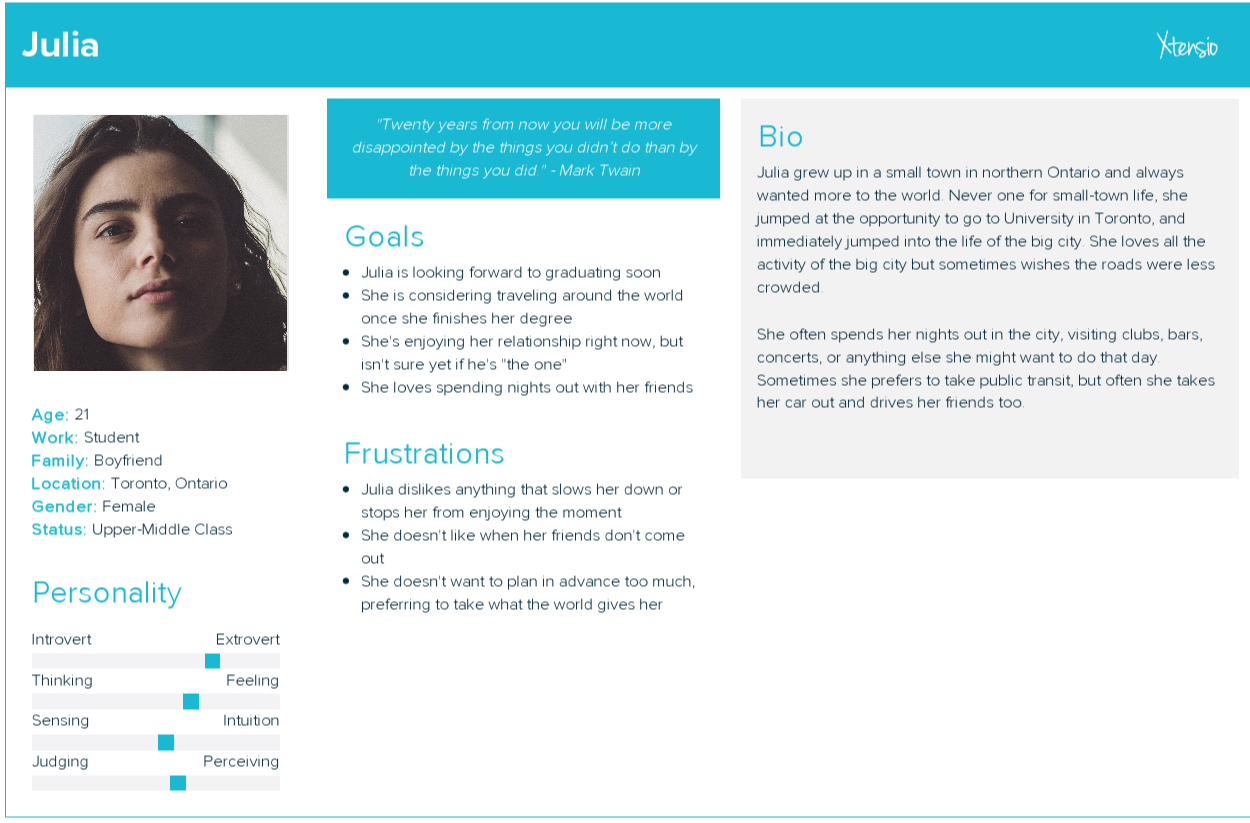
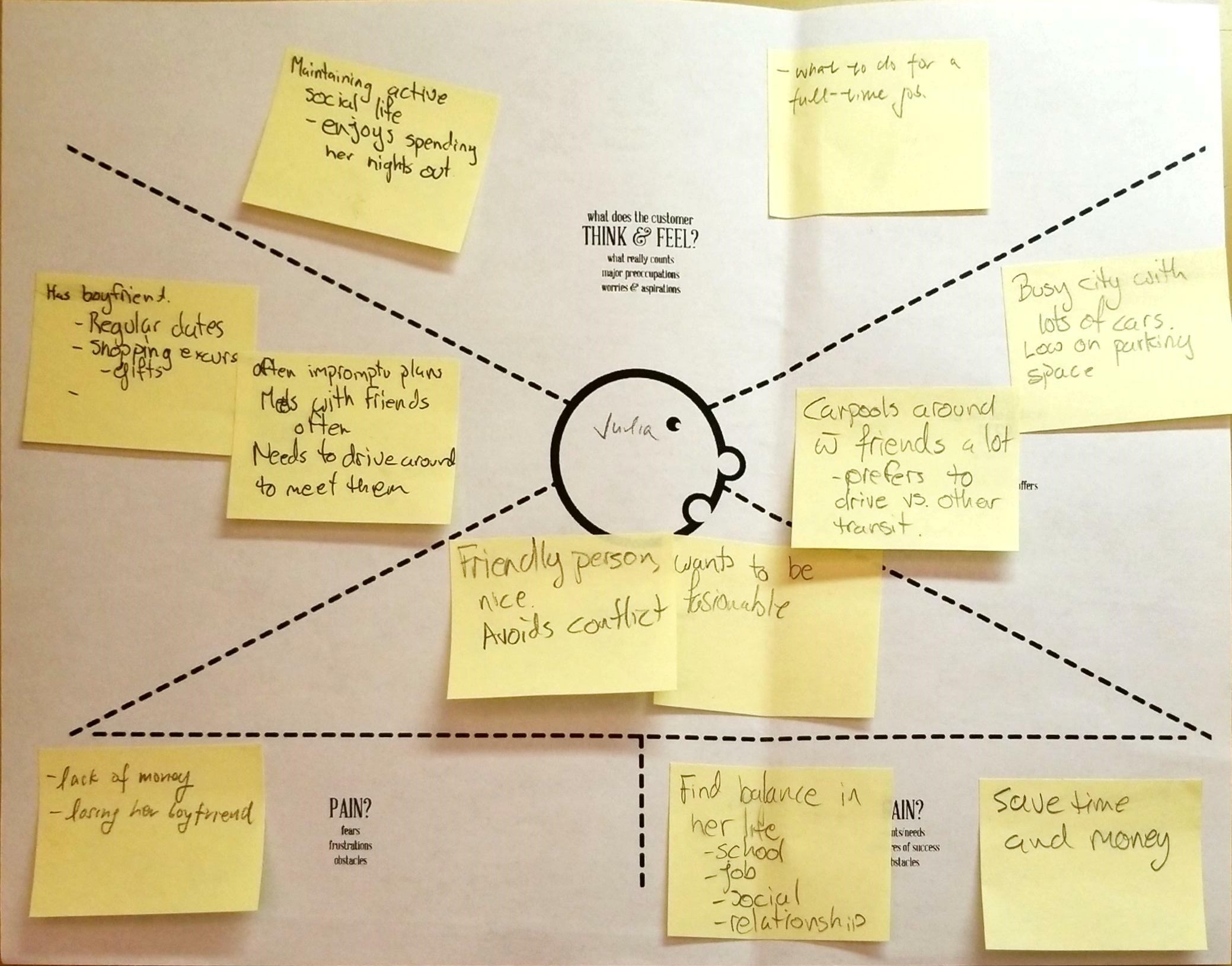
For example, Julia here is an excitable, outgoing student who loves clubbing and going out with her friends. We also attempted to emulate her thoughts using an empathy map.
However, just having imaginary people isn’t enough! We also needed data from real people, in which we conduct an exploratory study. The goal of this phase for us was to identity what obstacles are breaking the parking flow, and what habits users exhibit when they park.
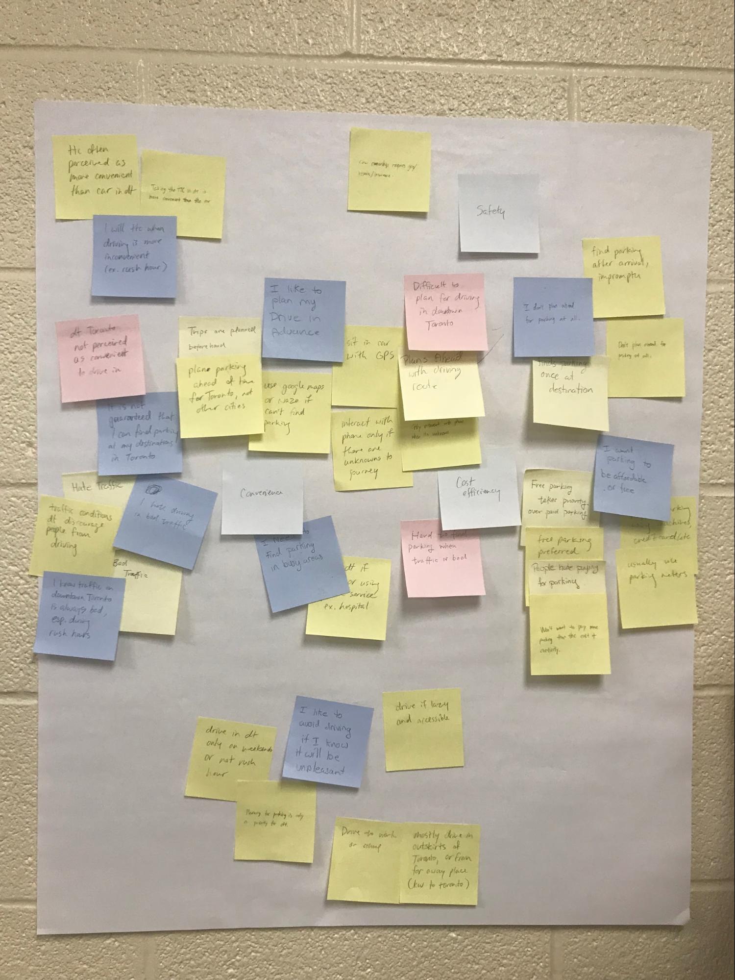
After interviewing our friends and family who each surprisingly match one of those personas, we created an affinity diagram and concluded that the problems can be summarized into three main points:
- Safety: Life is hard, so is driving in traffic.
- Convenience: Can’t plan parking because they’re going to be full anyway.
- Cost efficiency: They make it so hard to pay, might was well not.
The Design
We finally got to do some hands-on designing! An app can’t live without features, thus for the next step, we formulated initial design ideas to specifically tackle these problems.
For number one, we understood how finding a parking lot at the time of arrival can be cumbersome, especially in traffic. We envisioned a reservation system, so that users are guaranteed a spot when they arrive, lowering traffic and pollution. We also planned a flexible system for users to modify their booking in case of unexpectancy.
For number two, by employing near-field technology in road surfaces, we will gain the ability to detect occupancy information in real time. We leverage this technology to create a UI that displays detailed lot information.
For the last point, we envisioned a universal account system where the user can pre-load various payment methods of their choice and pay at the meter in front of each parking space, using either NFC or barcode scanning.
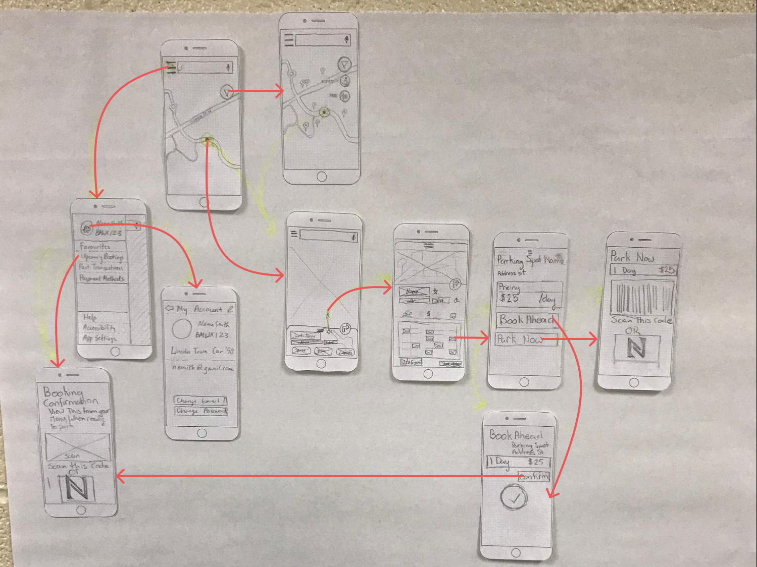
After a series of brain-spinning rapid sketches (8 sketches in 30 seconds per feature!), the design eventually evolved into a set of wireframes we all agreed on, connected by a user flow. This is our first iteration of the prototype.
The Evaluation
A large part of user-centered design is gathering feedback from users and iteratively improving it. Our prototype is no good if it’s not testable by the user! Thus, we chose to test our low-fidelity prototype using a paper prototype. Even though we had to remake every screen again, the result is more colorful, more interactable and most importantly, more material.
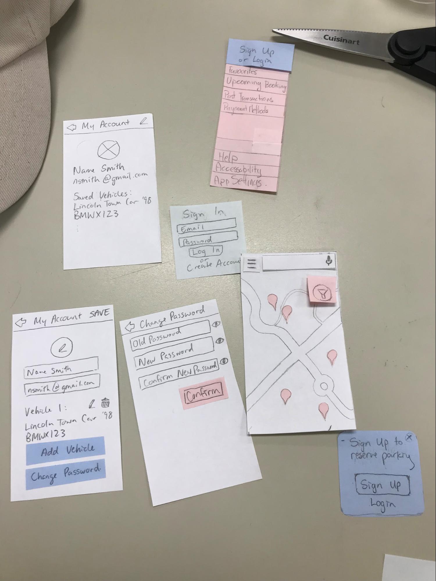
We chose a list of tasks for our testers to perform. They are:
- Reserve a parking spot near UW
- Register your vehicle
- Find your reservation
- Make an onsite payment
- Add time to a parking spot
- Create account
From the evaluation we learned a lot more about our design. Some of the feedback we received were:
“Do I not reserve in the parking rates tab?”
“The time input dialog looks like a text box.”
“Why is there a giant N on the confirmation screen?”
The Iteration, and Evaluation Take Two
We took feedback we gathered from the paper prototype study into making the high-fidelity prototype using Figma. We decided on visual design aspects including font (Cabin for headers, Roboto for body), color (a shade of orange to reflect an affordable and friendly ideology), as well as whitespace (a lot of it, influenced by Material Design 2). Oh and rounded corners everywhere.
It was obvious that the previous tabbed layout was flawed and confused a lot of users. So the parking lot information screen received a streamlined redesign. The confirmation screen received a revision as well, since the users wanted more than just check-in information.
Without rest, we began the evaluation of our high-fidelity prototype to examine the changes made to the UX. First, we asked users to perform the previous tasks, while having six heuristics to evaluate the app on:
- Visibility of System Status
- Match between system and the real world
- Consistency and Standards
- Flexibility and ease of use
- Help users recognize, diagnose, and recover from errors
- Purpose and Meaning
And it seemed like we hit particularly well on a few of those, specifically consistent design and tie to real world. However, one particular feedback we received is recovery from errors, which we then added a few more snackbars to direct to the correct action.
Second, we conducted a cognitive walkthrough that leads users through detailed instructions. We got feedback regarding the resulting screen from the back button, and that the entry to user profile was not obvious. It also wasn’t apparent that the user should select a parking space on the details page. But for the most part, our design choices led to an intuitive, easy to use application.
Conclusion
The users asked and we listened. Many of the feedback points were incorporated into our final design, which you can play with down below, including better user flow, and specific UI improvements such as the lot details.
Throughout the whole process we really saw how our designs evolved. Since we had such great results from the user studies, we knew exactly what needed to be done from the initial designs, which eventually evolved into the high-fidelity prototype. We all believe we honed our design skills and problem-solving skills tremendously.
It is also quite apparent that finding parking is still a pain point for drivers, especially those who frequent urban areas. So with the idea that there will be sensors embedded in parking lots to figure out when a parking spot becomes free, we will definitely set out to create the app!